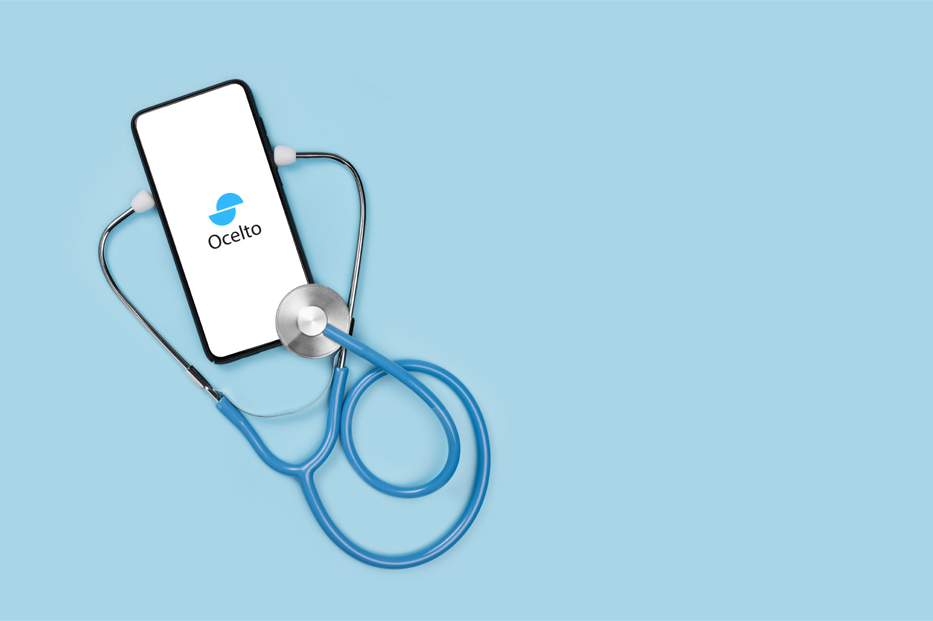
Ocelto is an online information service designed to provide reliable health information to users across the globe. It offers everything from the latest medical news to helpful tools for managing health.
Ocelto is an online information service designed to provide reliable health information to users across the globe. It offers everything from the latest medical news to helpful tools for managing health.
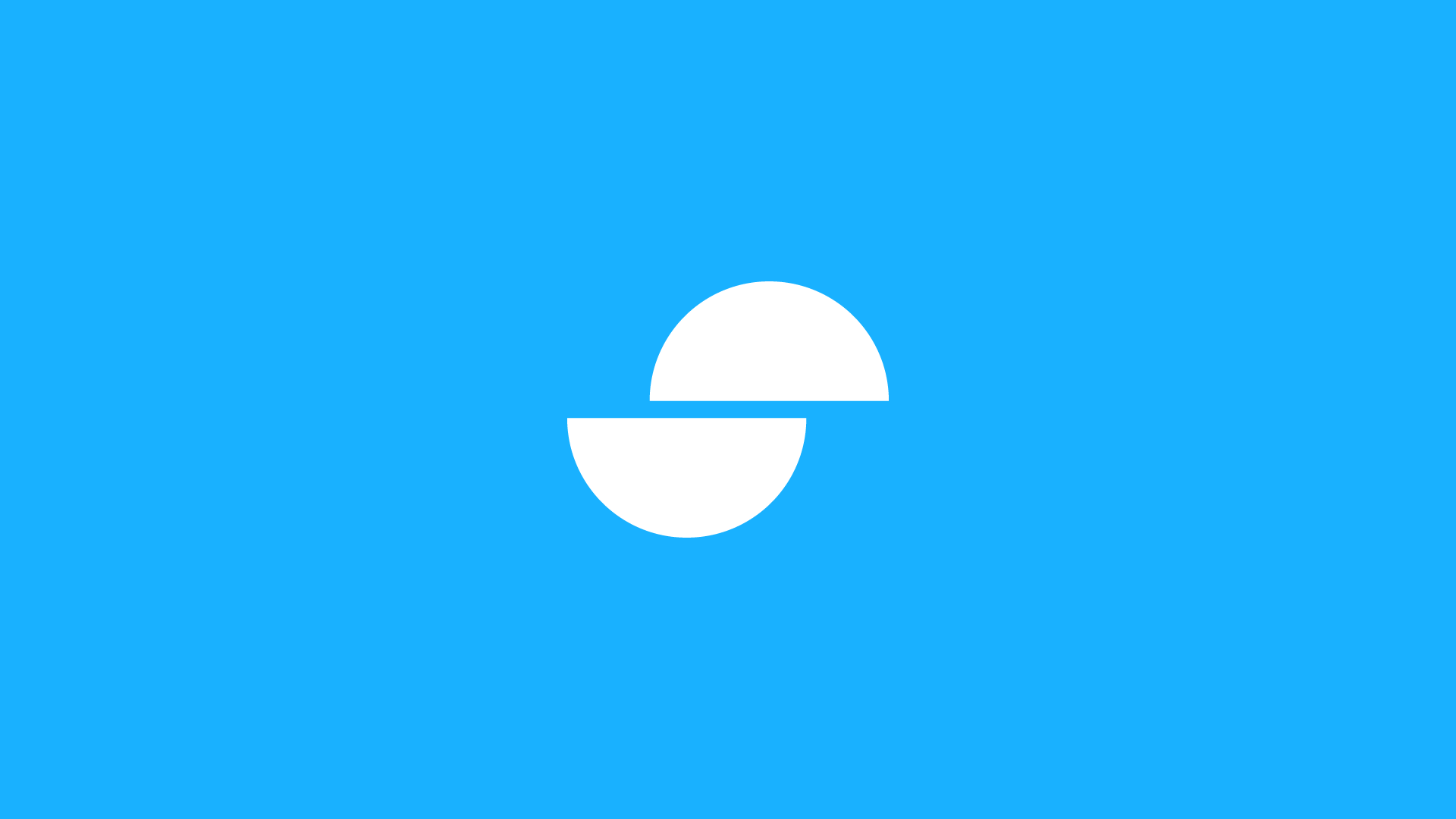
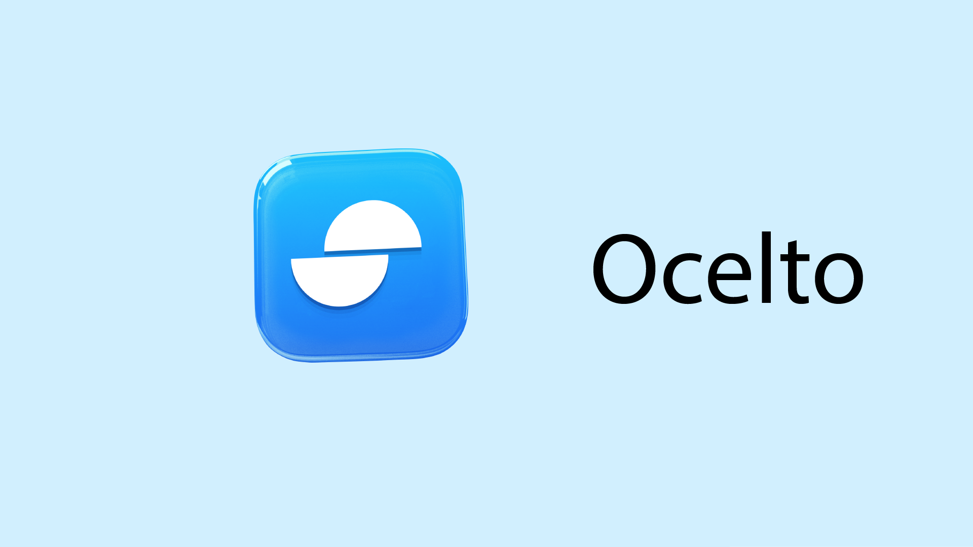
When tasked with designing the logo, the goal was to craft something that would not only be easy to remember but also visually represent what the company stands for. The resulting design is a clever combination of a sliced “O” that resembles a pill used in the medical field, and its positioning represents the flow of information.
When tasked with designing the logo, the goal was to craft something that would not only be easy to remember but also visually represent what the company stands for. The resulting design is a clever combination of a sliced “O” that resembles a pill used in the medical field, and its positioning represents the flow of information.